
Po: Maybe I should just quit and go back to making noodles.
Oogway: Quit, don’t quit… Noodles, don’t noodles… You are too concerned about what was and what will be. There is a saying: yesterday is history, tomorrow is a mystery, but today is a gift. That is why it is called the present.
My favourite dialogue from Kung Fu Panda is also my reminder against overthinking.
When the Reliance team invited us to discuss the revival of Campa, the iconic cola brand, we began by questioning whether to change, how much change, and what we need to achieve with that change. There were moments when we thought we should just go back to history and stay at that (quit?). It is very tempting to revisit the past as can be seen from some of the recent rebranding exercises like Burger King, Heinz and most recently, Pepsi. It made imminent sense for these brands to modernise their legacy as their glorious past was continuing into the present. But that was clearly not the case for Campa. It had faded into oblivion for decades.
Moving with times
One thing about a living brand is certain. It needs to be agile and move with the times, environment and audience. There is no straight answer to when or why rebrand. One size does not fit all. It entirely depends upon the life-stage of a brand and how rapidly its audience and ambition are evolving.
As we began our research on Campa’s residual equity, it became clear that the positive equity was limited to name, that too for the generation that had some exposure to the product a couple of decades ago. There was negligible or no recall of its logo or colours beyond a generic red. There was no fan base as such. In any case, this audience was clearly not the one we were aiming for as aerated beverages are likely to be consumed the most by Gen Z and the emerging Generation Alpha.
So we reached a consensus to limit the equity to the name and started exploring a completely fresh approach to branding Campa.
The last couple of years has seen a huge rise in online shopping for foods, personal care & home care. Whether D2C or not, almost all brands now reach their consumers through mobile-first. This has had the biggest impact on how visual identity and packaging are being re-designed. Aerated beverages are all about building excitement. The last Indian cola brand was born over 45 years ago. Today, we have to build a brand that is ready for ecommerce, retail and metaverse. Our first interaction with every brand is on our mobile screen, which gives us the liberty to be dynamic, vibrant and surprising. This is exactly what we want to achieve with Campa, given the brief was to break the status quo.
All of us love how Google changes its avatar. Then why not have different manifestations of the same logo for different beverages? This was another convention being broken by not having a monolithic, cast-in-stone logo.
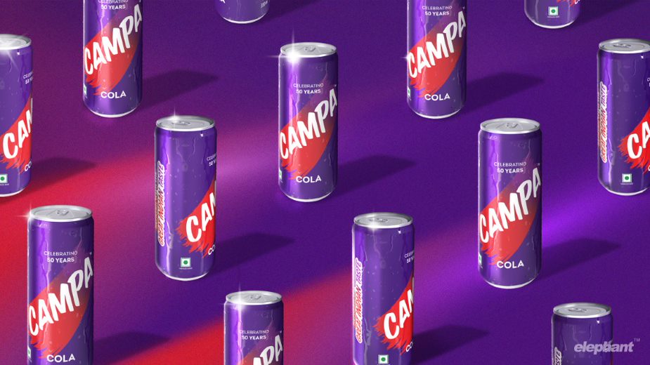
Brand hues
Our rebranding echoes the brand’s hero archetype, where the use of unconventional deep purple is complemented by a streak of bold, category-defining red: something we call the ‘swoosh’. This element connects to wiping a chilled can or bottle to reveal the brand, or even swiping motions on smartphone screens that serve to express, reveal or invite. The dual colour swoosh changes with variants.
The use of purple strikes a balance between category-dominant blues and reds while its transition towards red is to connect with the young cola consumers familiar with the category. Purple’s association with power, ambition, creativity and magic ties into the theme while giving the brand an aspirational look and feel.
Rebranding is for creating Gods & Angels. God is the person who unhesitatingly pays a premium to buy the brand you created. Angel is the person who goes to the next shop to buy it if it’s not available here.
We have made the start. This is our gift (in Oogway’s words). And we will wait to meet the Gods and Angels.
The writer is the co-founder and director of Elephant Design. Views expressed are personal.