Honasa Consumer, the parent company of popular brands Mamaearth, The Derma Co., and Aqualogica, has come up with a fresh corporate identity.
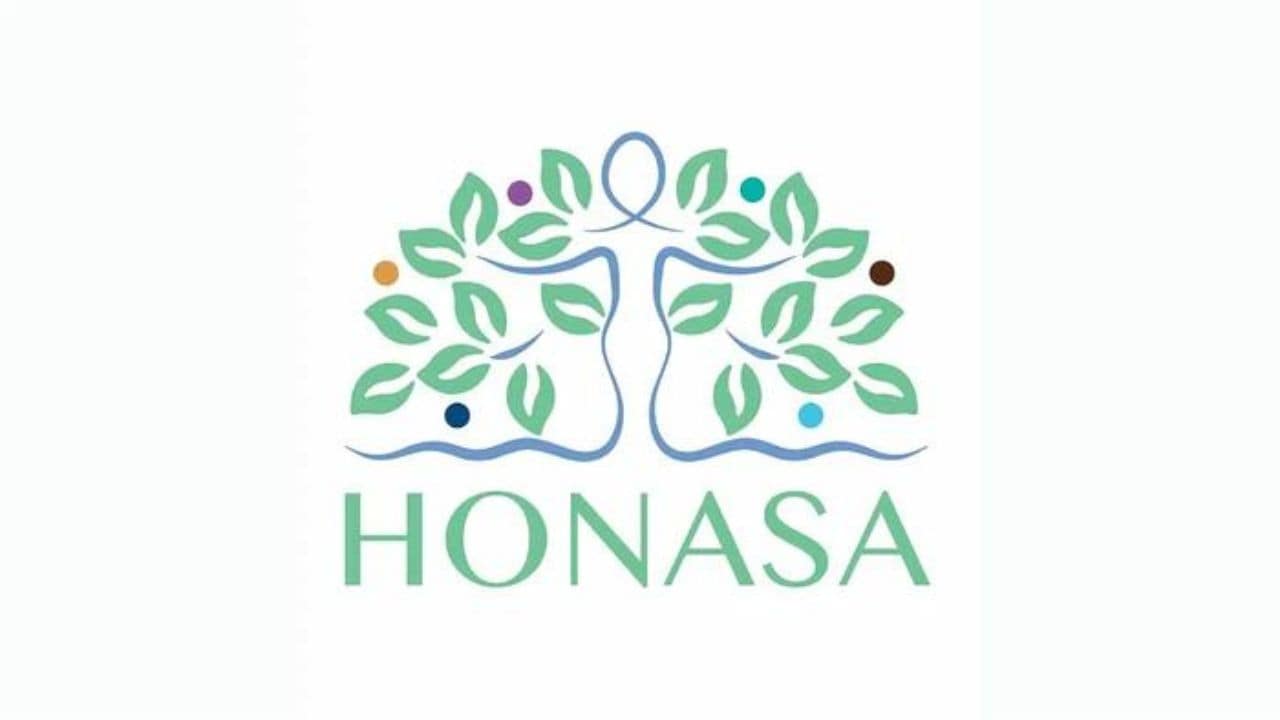
The new corporate identity is made up of three fundamental elements: an elegant female figure, the iconic tree of life, and a spectrum of vibrant circles.
The feminine silhouette is a reflection of the nurturing spirit of a mother, paying homage to the brand Mamaearth. The tree of life implies the ideals of progress, balance, and prosperity. The kaleidoscope of multicoloured circles speaks for the fruitful outcomes of dedicated toil and the diverse array within the brand portfolio.
The logo signifies agility, lucidity, and innovation. This unveiling is a representation of the company’s strive for evolution, innovation, and consumer centricity.
