Logos are visual symbols reflecting a brand’s values, history, and products, aiding consumers in recognizing and bonding with their preferred brands in a competitive market. Numerous food brands and restaurants have distinctive logos known for their unique colours. Some of these logos have changed over time while staying true to their core identity. They represent more than just products, encapsulating the brand’s history, excellence, and identity, leaving a lasting impact on consumers globally.
Here is a list of iconic food brands and the stories behind their logo legacies.
1] Dabur: Established by Dr. SK Burman, a physician based in Kolkata, Dabur came into being in 1884. This indigenous herbal brand has garnered a devoted following over the decades. The brand derives its name from ‘Daktar Burman.’ Initially, its logo featured a banyan tree alongside the logotype, symbolising nature and protection. In 2004, Dabur updated its logo, retaining the essence of its original design. The banyan tree, now more vibrant, still serves as a central motif, with its trunk representing three individuals forming the branches with raised arms. Even after a century of existence, Dabur remains relevant, boasting a robust consumer base and an annual turnover surpassing a billion dollars.
2] Amul Girl: In the 1960s, Sylvester daCunha of Advertising and Sales Promotion (ASP) spearheaded a campaign for Amul butter, aiming to boost its visibility in the Indian market against foreign brands. Their innovative approach involved topical advertisements featuring the iconic Amul girl, accompanied by witty taglines, engaging with current events and popular culture. Despite stiff competition from Polson Butter, Amul’s campaign, led by daCunha, illustrator Eustace Fernandes, and Usha Katrak, propelled the brand to dominance. The debut in 1966 of the Amul girl, depicted in a red polka-dot dress, riding a horse alongside the tagline ‘Utterly Butterly Delicious’, marked the beginning of a cultural phenomenon. Today, the noseless girl with blue hair remains a universally recognized symbol of Amul’s enduring success and innovation in advertising.
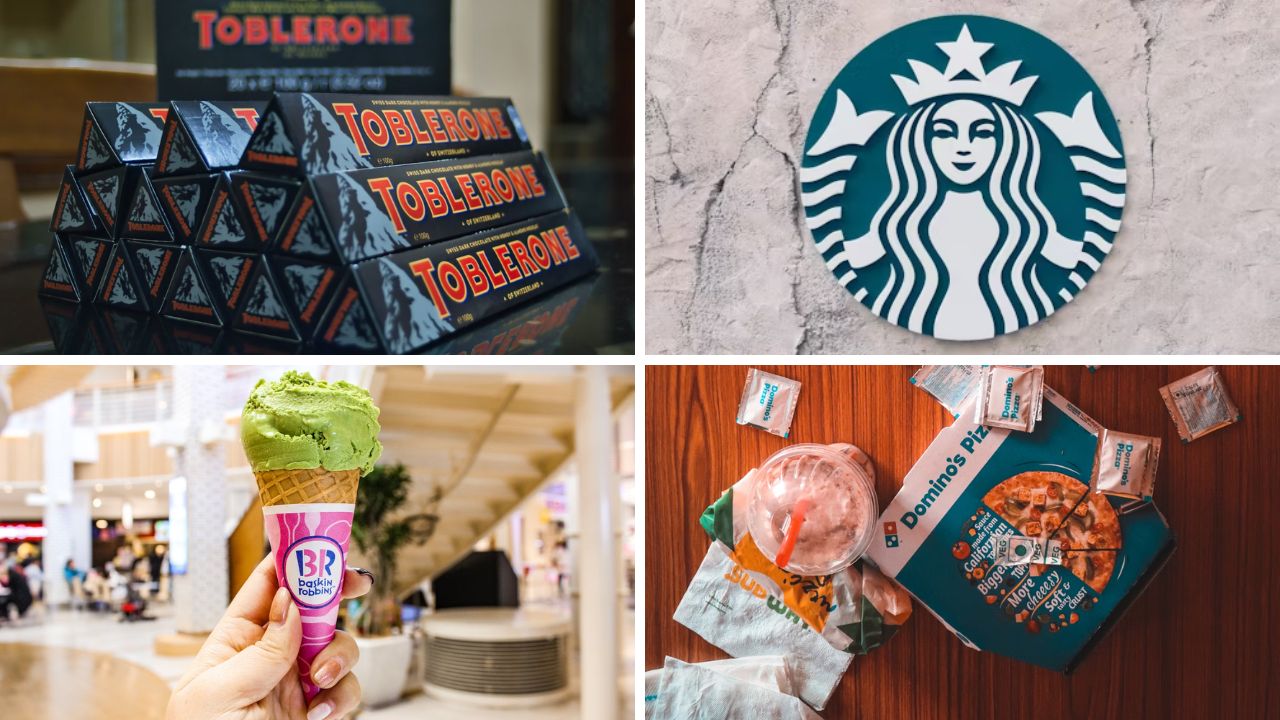
3] Baskin Robbins: The Baskin-Robbins logo may appear simple at first glance, but it holds a significant hidden meaning. The pink-coloured sections of the logo subtly form the number 31, symbolising the brand’s iconic offering of 31 different ice cream flavours, representing each day of the month. Founded in 1945 by Burton Baskin and Irvine Robbins, Baskin-Robbins started as a modest ice cream parlour in Glendale, California. Their shared passion for ice cream led to the creation of what is now the world’s largest chain of ice cream specialty shops. Initially boasting a selection of 31 flavours, the brand has since expanded its repertoire to include over 1,400 unique flavours in its library, solidifying its position as a global leader in the ice cream industry.
4] Subway: Since its establishment in 1965 as Pete’s Super Submarines, Subway’s logo has undergone significant transformations. Originally founded by Fred DeLuca and Peter Buck to fund DeLuca’s medical school education, the restaurant gained popularity and was rebranded as Subway in 1968, featuring iconic arrows on its signboard. The initial logo, a simple type-based design with arrows from the letters S and Y, underwent minor revisions over time. However, in 2016, Subway unveiled a major redesign, opting for a sleeker, modern logo with solid green and yellow colours. This updated design reflects Subway’s shift towards offering healthier, fresher options, while still preserving its core identity. Overall, Subway’s logo evolution showcases its ability to adapt to changing consumer preferences while remaining true to its roots.
5] Wagh Bakri: In 1892, Narandas Desai initiated his tea venture in Durban, South Africa, with a tea estate spanning 500 acres. However, faced with racial discrimination and political instability, he returned to India in 1915, having to restart his business anew. Desai embraced Mahatma Gandhi’s principles, which profoundly influenced both his personal and professional life. Following Gandhi’s example, Wagh Bakri Tea Company advocated for equality through its distinctive logo—a representation of a tiger (symbolising the British) and a goat (representing Indians) sharing a cup. This emblem, inspired by the philosophy of the Quit India movement, embodied the spirit of unity and aimed to combat racial prejudice. The company’s inaugural store opened in Ahmedabad, specialising in loose tea sales. It wasn’t until 1934 that Desai introduced tea under the brand name ‘Wagh Bakri,’ marking the beginning of the company’s enduring success.
6] McDonald’s: The iconic golden arches in the McDonald’s logo are more than just a symbol; they are an integral part of the fast-food giant’s identity. Designed by architect Stanley Meston in the 1950s, the golden arches were originally incorporated into the design of McDonald’s restaurants to catch the attention of passing motorists. The arches symbolise the welcoming entrance to McDonald’s, inviting customers to indulge in their favourite fast-food treats. Over time, the golden arches have become one of the most recognizable logos globally, representing not just a brand but also a cultural phenomenon synonymous with convenience, affordability, and, for many, childhood memories of Happy Meals and playgrounds.
7] Starbucks: The evolution of the Starbucks logo reflects the journey of the company from a small coffee roastery in Seattle to a global powerhouse in the coffee industry. The original Starbucks logo, introduced in 1971, depicted a detailed image of a siren, inspired by 16th-century Norse woodcuts. Over the years, the logo underwent several transformations, simplifying the image while retaining its essence. Today, the green, stylized siren is instantly recognizable, adorning coffee cups and storefronts around the world. The siren symbolizes the allure of the sea and the exotic origins of coffee, evoking a sense of adventure and exploration for coffee enthusiasts everywhere.
8] Nestlé: The Nestlé logo, featuring a nest with a mother bird feeding her baby, is a symbol of nurturing and care deeply rooted in the company’s history. Founded in 1866 by Henri Nestlé, a pharmacist, Nestlé initially focused on producing infant formula to combat infant mortality. The logo, introduced in the late 19th century, reflects Nestlé’s commitment to providing nutritious and wholesome products for families worldwide. The nest symbolises protection, nourishment, and the bond between mother and child, embodying the values of trust and reliability that define the Nestlé brand to this day.
9] Domino’s Pizza: The Domino’s Pizza logo, with its three dots arranged in a domino pattern, holds a hidden story of humble beginnings and exponential growth. Founded in 1960 by Tom Monaghan and his brother, James, Domino’s Pizza started as a small pizza delivery service in Michigan, US. The three dots in the logo represent the first three Domino’s locations that were open when the logo was designed. Originally intended to signify the expansion of the company, the dots have since become a recognizable symbol of quality, consistency, and convenience for pizza lovers worldwide.
10] Toblerone: The Toblerone logo, featuring a distinctive mountain shape, is more than just a symbol of Swiss chocolate; it is a tribute to the majestic Swiss Alps and the city of Bern, where Toblerone originated. Created by Theodor Tobler and Emil Baumann in 1908, Toblerone chocolate is renowned for its unique triangular shape, inspired by the triangular peaks of the Swiss mountains. The logo’s hidden bear motif pays homage to the city of Bern, known as the ‘City of Bears,’ and reflects Toblerone’s Swiss heritage and commitment to quality craftsmanship. With its iconic shape and rich history, the Toblerone logo continues to captivate chocolate lovers worldwide, offering a taste of Swiss indulgence and tradition.
Read More: Decoding auto manufacturers’ logos and their meanings