February 26 marked the day Nokia unveiled its rebranded logo at the Mobile World Congress (MWC). The new look and feel are far removed from the previous avatar.
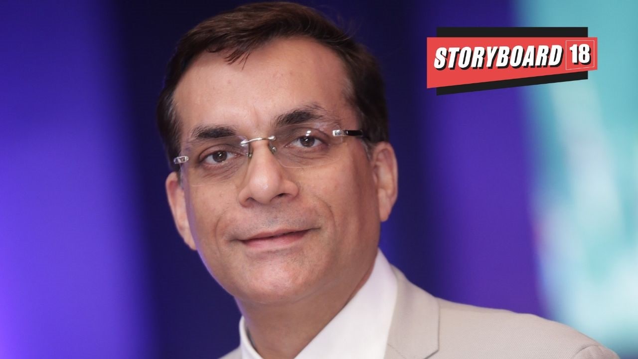
Amit Marwah, head of marketing and corporate affairs, Nokia India, told Storyboard18 that the process to change Nokia’s branding has been in the works for the last one-and-a-half years.
The Finnish multinational telecommunications, information technology, and consumer electronics corporation made inroads into the Indian market in 1995. From 1998 till the early 2000s, Nokia enjoyed great popularity and became synonymous with the mobile phone.
However, in the late 2000s, Nokia began to face stiff competition from brands such as Samsung, Apple etc, which very early on introduced the Indian market to smartphones. As per a media report, by 2012, Samsung was ‘The King of Indian mobile phone market’.
Though Nokia shifted its focus to networking equipment and offering services to businesses, its unsuccessful partnership with Microsoft (mobile phone division) in 2014 for $7 billion resulted in the latter pulling down the shutters. In 2016, Nokia bought back the business under HMD Global.
During the interaction with Storyboard18, Marwah also touched upon the profitability of the rebranding exercise, changes required in the marketing industry, his message for budding marketers and much more.
Edited excerpts:
What were the reasons behind Nokia’s rebranding decision?
Nokia’s primary business is connectivity, right from 2G to 4G and beyond. Nokia’s connectivity business is expanding into various other areas. It is not just about mobile phones, laptops or networks getting connected. That is why we refreshed our brand because we needed Nokia to be identified as a B2B company creating technology for the whole world to act together, especially with 5G and beyond.
We wanted to show Nokia as a technology innovation leader pioneering in the future where the network needs cloud. We wanted to showcase Nokia’s leadership in the space of innovation.
The other is Nokia’s commitment to delivering the next vertical network through technology leadership and trusted partnership. Networks are becoming critical for life. Home devices will be connected, factories will be connected, farms will be connected and various others.
We wanted to create a brand that was refreshed and would take care of brand promises. Future-ready performances mean that the future of networks that move into the cloud, pushing the boundaries of innovation technology. On top of that, security and reliability of networks will become very critical. Sustainability of network, future and connectivity will play a very important role in making the planet greener with sustainable solutions.

What was the brief that was given to the agency Lippincott with respect to Nokia’s logo and rebranding?
When Pekka Lundmark took up the role of President and chief executive officer, in his first Town Hall at Nokia, he made a promise to the company and employees that within the next couple of years, we would start looking at how we can refresh Nokia. I think, in the last one to one-and-a-half years, there has been a lot of work going on in creating this new brand logo.
We explained to the agency that Nokia wanted to establish itself as an innovation leader and as a B2B company. With this change, we want to showcase how the brand can become energetic, more dynamic and more digital.
Nokia was known by its blue and white colours. The world has changed post the internet age. Today, digital has become very important, and we wanted to design the logo in a way that kept pace with the digital world. We asked the agency to start thinking on these lines and create the logo accordingly. We got a lot of options for the same.
Read More: Nokia redesigns logo, signals a strategy shift as people think it still makes mobile phones
Was any research or study conducted to understand consumer behaviour and arrive at the logo’s shape and colour?
There was intense study and research that was conducted in multilingual ways. Nokia visited various countries and we showcased the rebranded version in order to check the recall among consumers. We received 100 percent recognition with the rebranded version. With respect to the brand, there are three colours that go in the logo. It is white, blue or black. The background can change into a full kaleidoscope of colours, which reflects vibrancy and energy.
The other thing that was looked into was: how does the brand fit into our vision. We believe that we want to create technology for the world to act together. In the new logo, the alphabets are broken. But, when they join together, they act together to give that exact feel. People are able to read it in various languages across geographies etc.

Speaking of the past logo, which was introduced in 1967, how do you view the role it played in the growth of the brand?
It was extremely relevant at that point of time. We wanted to create a bold and solid image for Nokia by using the colours blue and white. Mobile went on to become identified as Nokia. I think the logo went well with the period when Nokia as a B2C company was strengthening its foothold. Nokia gained recognition and we kept it in the same spirit for a very long time.
Nokia, which is now moving beyond connectivity and looking into enterprises, industries, smarter cities, agriculture and medical-use cases, is more a B2B company. We want the brand to resonate with the youth. It is also a way of encouraging the younger generation to embrace and be proud to consider joining Nokia by paying attention to the vibrancy Nokia now resonates with.
I believe Nokia also did an internal survey. Most of the employees have given their blood and sweat for the company and have a deep attachment with the old logo. We wanted to understand how employees would react to the transition, which is a big move. The response turned out to be positive.
Will the old logo be used for the mobile business by HMD Global?
Yes, for any Nokia licensing arrangements, the old logo will be used.

On April 26, it will be two months since the logo got rebranded. How has the reception been so far?
I was present at the Mobile World Congress. We created the whole booth with the new branding and the new Nokia feel. It turned out to be stellar and became a selfie point. So far, there has been no negative feedback, and there has been only positive output from all corners, right from the government and customers to end users.
What we have done is, we have used three letters of Nokia’s rebranded logo (N,O,K) as amplifiers. If you look at Nokia’s presentation, in the background of that presentation, there is a visualisation of N,O or K, not all of them. There could be a broken N in the background in different colours.
We recently launched a campaign that speaks on the power of ‘N’, which is raised to the power of infinity. It highlights that Nokia is moving towards infinite sustainability, which includes gender equality, infinite growth of the company etc.
What is the target audience for the rebranded logo?
GenZ (those born between 1996 and 2010) is one of the focus points of the target audience we cater to. Gender equality is a big factor. In Nokia’s new logo, there are different colour lanyards that highlight gender equality. The logo is colourful and reflects energy. It also resonates with our consumers and our partners. This also includes catering to other customer domains like startups.
What were the challenges and apprehensions when it came to the rebranding, given how entrenched the brand has been over the years?
Speaking of challenges, the work on Nokia’s rebranding was happening for a year. Very select people were aware of what was in the making, to keep it as a surprise, so that it could be launched at MWC in a big bang way.
Re-registering a brand is not a simple exercise because Nokia is present in 150 countries. The other step that we are taking is to rebrand our existing offices with this new logo.
During the logo rebranding, as far as I can remember, more than 10 options were presented for Nokia’s new look and feel. There could have been apprehensions but unanimously, everybody agreed and was supportive to this present look and feel.
Earlier, the colours used for the logo were mainly blue and white. It was a blue logo with a white background, or white logo with a blue background. What we said was that inside the logo, if too many colours are used, then, it would not contrast well with the vibrant palette of kaleidoscopic colours present in the background. So, the logo has been designed in three specific colours, depending on how they matched with the background.
Overall, how profitable is rebranding as an exercise for brands? What are the pros and cons?
In the case of Nokia, only time will tell how this brand refresh will create a larger brand value for the company. For any brand, rebranding is a huge decision to bring a change in its look and feel. But, if it doesn’t go well, then it could actually have a huge impact on your brand value.
Who are Nokia’s main competitors today?
In this space, it is mainly Ericsson, and Chinese brands like Huawei. If you look at Nokia’s end-to-end portfolio, we are the largest in terms of offerings — both in software and hardware. Ericsson comes after us, and Huawei is similar in terms of portfolio. Then, there are other companies like Cisco, who are competing with us with respect to certain domains we tap.
Could you also highlight the partnerships Nokia is exploring with telecom operators like Bharti Airtel and Reliance Jio, which own 5G spectrum?
We have officially announced that right now, we are rolling out some of the largest 5G networks that have been deployed in the world, in India with Bharti Airtel and Reliance Jio. We are their significant partner. Till 4G, Nokia maintained a leadership position as a vendor in India. We continue to lead in terms of our market share and positioning. We aim to grow that with the rebranded version by connecting with new customers, especially enterprises.
As the head of marketing, what are the changes you have witnessed in the marketing landscape? What are the changes the marketing industry needs to make to improve the profitability of their brands?
It always used to be ‘Mind Share’ before ‘Market Share’. If you have the right mind share, market share always follows. That has been our motto in terms of marketing. From that lens, marketing is extremely important for it puts the seed, and creates the confidence. But, with the advent of digitalisation, everything being so readily available and social media being extremely important and relevant, marketing has leapfrogged. It is not only about indulging in media engagements or releasing some articles. It is also about how you are perceived by end users on social media on how you can simplify things.
How technology can be simplified through marketing and communicated to the end user — as to how it would bring a change in their lives — is the big transition we are seeing right now.
What is your message for budding marketers who want to make a mark for themselves in this industry?
Being open, fearless and empowered are the three essentials or values that Nokia prescribes. Out of these, fearlessness and openness are two essential traits that are extremely important for marketing. One does not need to be challenged or fearful of coming up with new ideas and how they will be perceived.
GenZ is a category that embraces new ideas of marketing. For young marketers, this is the best time to be in the marketing and communication space.
What are the skills you look for today in marketing and what are the important future-facing roles you are hiring for?
Younger people and younger ideas are what we are looking at. When I look at people, it is about how a person is able to think differently and move away from conventional thinking. With regard to other skills, digital marketing is extremely critical.
Watch and listen here: HMD Global’s Sanmeet Singh Kochhar and Adam Ferguson on reviving Nokia for the consumer of today
