January 10, 2020. I’m on the stage with my colleagues from 82.5 Communications. We’re deliriously happy, cheering wildly. It’s the night of the Effies and Bisleri—a brand we’ve had the privilege of partnering—has just been awarded the Grand Effie, giving it the distinction of being the most effective brand in the country. What a glorious feeling!
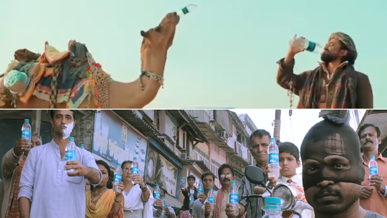
Bisleri’s penchant for being creatively effective over the years is what has made it the number one water brand in the country. As the agency, it was a pleasure working with them because they had the wisdom to let us create campaigns like the winning one in which camels were the water experts. A brand with a narrower vision would have asked for a man in a lab coat or a celebrity to endorse it.
Sometimes, in the world of advertising, we tend to think of creativity only in terms of ads. But the multi-award-winning camels campaign was just the icing on the cake for Bisleri. Because it’s a brand that’s used to being creative—not only in the way it advertises, but in every aspect of its business.
The witty and wise
Bisleri is a brand on everyone’s lips—not just the water in the bottle, but the name on its label. So just as people say Cadbury when they mean chocolate, Dalda when they mean ‘vegetable ghee’ and Pampers when they want diapers, they asked for Bisleri when they wanted packaged water. Very often, it was specifically the brand Bisleri that the consumer wanted—but if shopkeepers pushed a different brand he would accept it. The witty and wise camels arrived on the scene and changed that by making the point that ‘samajhdar jante hain ki har pani ki botal Bisleri nahin.’ (Smart people know that every bottle of water is not a Bisleri.) Hum gadhe nahin, oont hain (We’re camels, not donkeys) is another line that stuck. The memorable manner in which the message was delivered got people to insist on Bisleri.
Another problem that Bisleri has faced is the plethora of counterfeit brands. This is exacerbated by the fact that many consumers can’t read English so it’s easier for copycat brands to trick them. Bisleri displayed another stroke of creativity when it launched bottles with labels in regional languages a few years ago. A far larger number of consumers are literate in their own language as compared to English and this move made it easier for them to identify the genuine article.

Pandemic shifts and customer service
Bisleri creativity manifested itself yet again in the doorstep delivery that they set up during the pandemic. The agency was ready with its ads featuring Badal the animated camel to communicate this consumer-friendly step. It was a lovable campaign with an endearing character but the masterstroke of course was launching contactless home delivery of pure water at a time where people were stuck at home and anxious about their health.
A lot of the advertising that was created by various Indian brands during the pandemic acknowledged the prevailing situation and tried to be sensitive to the mindset of consumers. But Bisleri was one of the smaller set of brands that went a step further to do something about it by coming up with safe doorstep delivery. In terms of communication, the brand did not shy away from its trademark style of humour even when other brands sought to adopt a more serious tone to reflect the sombre mood of the people. The communication worked because people wanted some relief from the grimness of reality. It was yet another feather in the creative cap of Bisleri.
Blast from the past
Rewinding to 2013, the kiss to drink campaign was yet another interesting series of ads. It was for the 500ml bottle which was being positioned as your ‘personal’ bottle of water. When you bought a 1 litre bottle it was sometimes too much water for you to consume and you ended up having to share it or waste it. The smaller bottle was just the right size. Playing off the Indian concept of ‘jootha’ the campaign asked you to ‘kiss’ your bottle of water to mark it as exclusively yours.
Let’s travel further back in time to the earliest days of the brand. Bisleri was originally Italian-owned. A gentleman by the name of Felice Bisleri launched it in India in 1965. It was rather an elite brand at that time, consumed by foreign visitors or Indians who frequented 5-star hotels. The average Indian could not imagine buying bottled water even though the unboiled, unfiltered water available to drink outside the home was often contaminated. When Parle bought Bisleri, the company had the creative genius to recognise that there was a latent demand for packaged drinking water in our vast country and it was possible to turn the brand into a mass market product. This foresight seems all the more amazing when you consider that in Indian culture water is something that’s given for free.
Colour branding: From blue to green
Jumping forward in time to 2006, another creative act of Bisleri was changing its brand colour from blue to green. By this time there were a plethora of water brands in India and all of them were in shades of blue. So this was a great way for Bisleri to differentiate itself. But this is not as obvious a step to take that it might seem in hindsight. Brand gurus might have said at that time that blue was the colour associated with pure water and it would be suicidal to move away from it. But yet again Bisleri displayed its creative vision by going green.
Like many other brands today, Bisleri also faces the challenge of mitigating the environmental impact of its packaging. They already have the Bottles for Change programme, a plastic recycling initiative. And I am sure that the brand will use its inherent creativity to find more ways to become sustainable in the days to come.
Meanwhile, the brand seems all set to enter a new phase in its journey. Every step it takes in the future will, I hope, be a path-breaking one that keeps its creative vision intact and is worthy of its great tradition of innovation. After all, to use the lingo of its oldest campaign, ‘Bisleri is veri veri extraordinari’.
Sumanto Chattopadhyay is a former chairman & chief creative officer of 82.5 Communications, an Ogilvy owned specialist agency. Views expressed are personal.