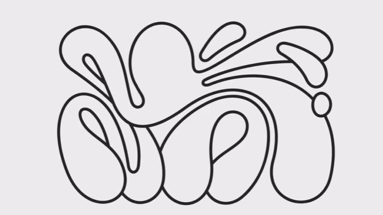
Advertising agency MullenLowe recently refreshed its identity and came up with a new logo. The logo’s design seems largely abstract but is in fact an octopus, that is the result of brainstorming that happened over the last year.
The logo will soon be available to all the agency’s employees where they can create their own personalised versions of the octopus. The previous logo was a ‘Çhallenger Octopus’ and was the agency’s identity since 2016, a year after Mullen and Lowe merged.
As per Ad Age, Joao Paz, head of design, MullenLowe US, who headed the project mentioned that they had begun to feel that the ‘Challenger Octopus’, with boxing gloves had gone out of style. “It has this kind of masculine vibe of being punchy, punching above your weight. We felt it didn’t really represent us anymore,” he said.
He added, “That was kind of the brief—it felt like MullenLowe was showing up feeling a little old. So we took that brief to heart and created a new logo that broke from everything. That was the challenge—to break free from the corporate agency world.”
Hence, they decided that the logo needed to be more dynamic, with a sense of fluidity and reinvention. Though coloured versions were tested, black and white emerged as the ultimate choice. The logo was initially meant to represent the agency’s US branch. However, once it was shared with global leads, they decided to have it represent the agency globally.
The agency also created an app where the employees could create a unique marking for themselves, which they could use on business cards and email signatures.
