In the 1970s, Delhi-based Pure Drinks Group, which was considered a pioneer in the soft drinks industry, came up with a soft drink brand, Campa. It was the same group that had, in 1949, laid the carpet for Coca-Cola’s entry into India and had been its manufacturer and distributor. But the journey of Coca-Cola was short-lived.
In 1977, Coca-Cola was asked to wind up its operations when it refused to follow the Foreign Exchange Regulation Act. This Act mandated foreign players to partner with an Indian entity, which would have meant revealing their secret recipe. The person who uprooted the brand from its roots was the former industry minister in the Morarji Desai government, George Mathew Fernandes.
As Coca-Cola exited in the 1970s, it proved a golden opportunity for Pure Drinks’ Campa. When Coca-Cola re-entered India in 1993 during the period of liberalisation, it found survival difficult.
In August last year, Reliance Industries revived nostalgia by acquiring home-grown soft drink brand Campa for Rs 22 crore. Campa is now seen on retail shelves in a new avatar. The brand was re-launched in three flavours – Campa Cola, Campa Lemon and Campa Orange. To begin with, Reliance Industries has started rolling out the brand in Andhra Pradesh and Telangana.
In an interview with Storyboard18, Ashwini Deshpande, co-founder and director of Elephant Design, the design consultancy behind the redesign of Campa 2.0, discussed the colour psychology behind the brand’s logo, refreshed packaging, the research to understand consumer behaviour, and more.

Edited excerpts:
What was the brief given by the brand for the redesign?
The brief was to break the status quo in India. The last leading cola brand to be created in India was over 45 years ago. The other brands are global giants with an even longer history. So, it was about time we questioned the category codes and changed them in favour of young confident Indians.
The brief led us to explore the branding opportunities on a clean slate. The only legacy we were going to take forward was the name. Our deep dive into the category and residual brand equity of Campa revealed some fondness for the name, but there was no love lost on the visual identity.
Since the team of Reliance Consumers Products Limited (RCPL) had the reach, ambition and resources to transform Campa into the ‘Great Indian Cola’ that was missing in the beverage landscape, everything was up for change – the colours, logo type, and, most importantly, the attitude.
What was the psychology behind choosing the colours in the logo and packaging?
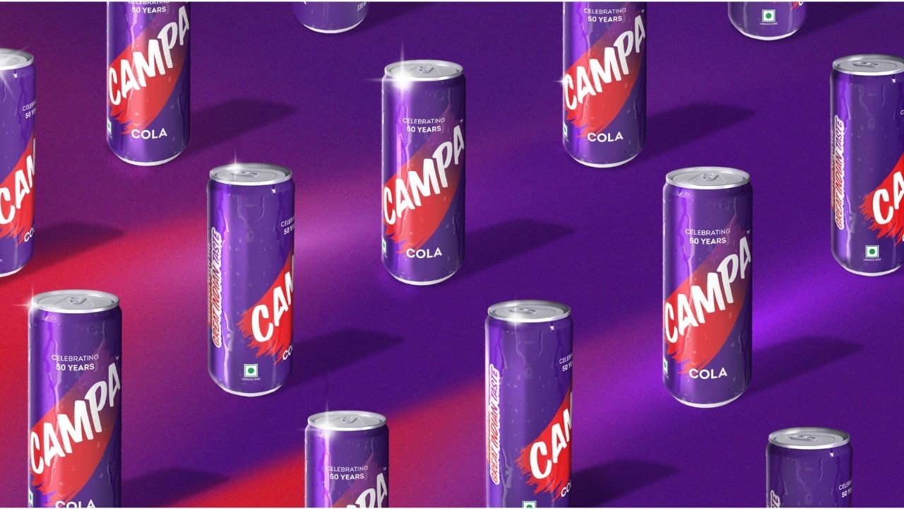
Our rebranding echoes the brand’s hero archetype, where the use of unconventional deep purple is complemented by a streak of bold, category-defining red: something we call the ‘swoosh’. This element connects to wiping a chilled can or bottle to reveal the brand, or even swiping motions on smartphone screens that serve to express, reveal or invite.
The use of purple strikes a balance between category-dominant blues and reds, while its transition towards red is to connect with the young cola consumers familiar with the category. Purple’s association with power, ambition, creativity and magic tie into the theme, while giving the brand an aspirational look and feel.
Was the redesign supported by any consumer research?
The research, which was conducted on the ground and online across India, involved two things. It was done to enhance our understanding of the brand. We studied the landscape of aerated beverages in India. This was followed by studying their consumption patterns.
The other part we looked into was Campa’s equity: What is it that people recall about Campa? What is it that they should carry forward? Rebranding is about carrying forward what has worked, and discarding what needs to change or align with the new set of audience.
Was there any worry that bringing a change in logo and packaging would affect its comeback?
This discussion did take place. But, when we look at the equity of Campa and its audience, it is not the same audience. The audience who have some memory with the brand is not the intended audience today. We are building a brand for the young, ambitious and aspirational Indians.
Though the name highlights the iconic status of the brand, nothing else had that degree of recall or equity for Campa.
How important is it for brands to experiment with colours? Is it a wise decision for legacy brands to experiment with colours in order to adapt to changing times?
An ambitious brand entering an established category can announce its differentiation on a single virtue of colour. I can give many examples where the status quo was broken and those brands went on to become category-leading icons.
When we worked on Britannia Bourbon, the category of chocolate cream biscuits was either packaged in browns or in a me-too of the well-established Cadbury purple. We chose a metallic rust colour that evoked taste and helped stand apart as the leader. It has worked for the brand wonderfully, for more than a decade now.
Too Yumm was another brand where we chose black as the headline colour when the category was full of bright colours. The role of black in establishing this brand has been phenomenal. Similarly, in a sea of blue labels, Bisleri went teal and Tide chose orange.
One should never take the role of colour in establishing the semiotics of a brand lightly. Colour is a very potent tool in branding.
Do you think new-age brands should experiment with varied colours or stick to a specific colour adopted by legacy brands like Amul, Parle-G etc? Is this move feasible in the long run?
We all love Google for what they do with their visual identity. Today, no brand identity can be visualised without understanding the role it will play on screens. A logo must work as well on a screen or an app icon as it must on the label or billboard.
We are building Campa as the brand of the future, ready for e-commerce, retail and metaverse. While there will be consistency in the logo for print, we saw no reason to refrain from developing dynamic colour palettes as the screen and motion graphics add so much to a brand’s presence.